Business Logo Design: Process, Pricing, and What Separates Great Logos from Generic Marks
A comprehensive guide to logo design: the 5-stage creative process, realistic Israeli pricing tiers, mandatory final vector deliverables, 7 red flags for generic designs, and bilingual Hebrew-English typography rules.
Logo design is often a new business's very first branding expenditure, making it the easiest place to make costly mistakes. On one hand, automated online logo generators promise instant results in five minutes. On the other hand, agencies quote thousands of dollars without clearly explaining what deliverables are included. In this comprehensive guide, we deconstruct the entire business logo design workflow step by step. We explain what occurs at each stage, realistic pricing tiers across different vendor types in Israel, and the essential vector files you must receive upon completion. Additionally, we reveal 7 unmistakable signs of a generic logo and address the topic most English guides overlook: designing bilingual logos with Hebrew RTL typography.
What a Great Logo Must Do (and What It Should Not)
A logo is not the brand itself; it is the brand's signature. The overarching brand encompasses your market promise, voice, service standards, and customer experience, as detailed in our guide to branding for small businesses. A logo has three modest yet crucial functions.
First, recognition: a prospect who encounters your brand once must instantly recognize you the second time. Second, versatility: your logo must perform flawlessly on a giant outdoor billboard, a 40-pixel WhatsApp profile icon, and a monochrome printed invoice. Third, positioning: it must align with your industry, audience, and price point. A logo styled like a venture-backed tech startup will look out of place for an established law firm, and vice versa.
Conversely, a logo should not attempt to “tell the entire company history”. Packing a house, key, and tree into a single mark creates visual clutter rather than clarity. The most enduring commercial logos are almost always the simplest. Before starting design, answer one foundational question: what is the single emotion your logo must evoke? Luxury, accessibility, surgical precision, or warmth? That answer establishes your creative brief.
The 5-Stage Logo Design Process Found in Every Successful Project
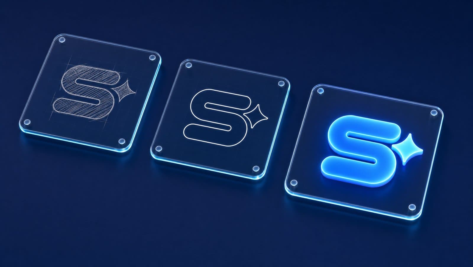
Whether collaborating with a freelancer, boutique studio, or branding agency, a structured logo design workflow follows five consistent milestones. If any stage is skipped, proceed with caution.
1. Strategic Brief
A structured questionnaire or discovery session covering what your business does, target demographics, direct competitors, visual preferences, and brand positioning. Without a brief, designers are merely guessing.
2. Market & Competitor Research
Auditing the visual landscape of direct competitors and industry benchmarks. The objective is to map category color norms and determine whether to align with or boldly diverge from market conventions.
3. Conceptual Directions
Presenting two to three distinct creative concepts rather than minor variations of a single idea. Each concept is demonstrated in real-world mockups: on business cards, mobile screens, and building signage.
4. Iterative Refinement
Selecting the strongest direction and fine-tuning proportions, letter spacing (kerning), color harmonies, and horizontal/vertical lockups over 2–3 structured revision rounds.
5. Asset Packaging & Final Delivery
Exporting the finalized master mark across all required vector formats and responsive orientations, accompanied by a practical usage guide.
A thorough design cycle typically spans two to four weeks. Anyone promising a professional, custom-crafted logo in 24 hours is cutting essential corners.
What We Observe in the Field
The first question we ask during client discovery is not “what visual style do you like?”, but “where will this logo live over the next 12 months?”—website, WhatsApp avatar, vehicle wrap, storefront sign, or printed invoices. The answer dictates necessary layout lockups and technical asset exports. At Simple Web, logo design is the second stage in our proven branding framework: strategic research, logo design, typography and palette engineering, visual systems, and comprehensive Brand Books over a 2–4 week cycle. The most common error we encounter is approving a logo from a vibrant, full-screen mockup without verifying its legibility as a 16px favicon or in monochrome. We present concepts solely in real-world contexts: on mobile devices, collateral, and signage.
How Much Does Logo Design Cost in Israel? Pricing Tiers by Vendor Type

While there is no fixed market price list, the following realistic ranges reflect current Israeli market rates and client estimates. The pricing spread is substantial, reflecting the depth of strategy and deliverables provided.
- AI Generators & Online Builders: Free to ~₪300. The “free” version usually provides low-res previews, while vector source files require payment. No custom research or uniqueness guarantees; results are shared by thousands.
- Junior to Mid-Level Freelancers: ~₪800–3,000. Typically 1–2 directions and a single revision round. Quality varies widely, making portfolio review critical.
- Experienced Designers & Studios: ~₪3,000–8,000. A comprehensive process including market research, multiple concepts, refined iterations, and complete file packaging.
- Branding Agencies (Logo + Visual Identity + Brand Book): ~₪8,000–25,000+. The logo is engineered as part of an end-to-end brand system including brand strategy, typography suites, color theory, and multi-channel asset templates.
Key cost drivers include the number of initial concepts, revision rounds, Hebrew/English bilingual versions, and collateral mockups. Always ask upfront: what happens if none of the initial directions resonate? For a detailed analysis of automated alternatives, read our honest assessment of AI logo design.
Essential Files You Must Receive Upon Project Completion
Many business owners discover years later that they only possess a single low-resolution JPG on a white background, forcing an expensive redraw when ordering physical signage. Before issuing final payment, ensure you receive:
- Master Vector Files (SVG, AI, EPS, or vector PDF). Scalable to building-size signage with zero pixelation or loss of crispness.
- Transparent PNGs in multiple resolutions for immediate use on websites, social media, and digital presentations.
- Color Variations: Full color, solid black (monochrome), and pure white reversed (for dark backgrounds).
- Layout Variations: Horizontal lockup, vertical stack, and standalone icon/mark for favicons and social profile avatars.
- Exact Color Codes: HEX for web, RGB for digital screens, and CMYK/Pantone for print production.
- Font Names & Commercial Licensing Information to ensure legal commercial font usage across your marketing.
- Brand Usage Sheet: Minimum clear space margins, minimum display sizes, and prohibited distortions.
This deliverable checklist represents the foundation of a professional Brand Book. Even without a full agency rebrand, a single-page usage sheet prevents misbranding by future vendors.
If the logo will also appear in videos, Reels or motion on your website, it needs its own set of files, covered in Logo Animation for a Business: Where an Animated Logo Works, Which Files You Need, and When to Do It Yourself.
7 Unmistakable Red Flags of a Generic Logo
A generic logo is not necessarily poorly drawn; it simply fails to represent a unique brand identity. Here are the diagnostics we run:
- The Competitor Swap Test: Place your logo alongside a direct competitor's and swap company names. If both work equally well, you have zero brand differentiation.
- Stock Icon Clichés: Generic globes, abstract swooshes, overlapping leaves, or roof outlines found on thousands of template sites.
- Default Typography: Company name set in standard Arial or Roboto without custom kerning or modification is plain text, not a logo.
- Visual Overcrowding: Combining an emblem, tagline, founding year, and multi-color gradients into one mark results in an illegible smudge at small sizes.
- Fails the Monochrome Test: If a logo loses its shape and meaning in pure black and white, it relies on superficial gradient effects rather than sound geometry.
- Trend Chasing: Over-polished skeuomorphism from 2010 or identical generic tech minimalism that will appear dated within two years.
- Trademark Infringement Risk: Uncomfortably resembling an existing registered trademark can result in cease-and-desist notices after you have invested in print materials. Formal trademark searches are conducted through the Patent Office, preferably with legal counsel.
Self-Audit Technique: Scale your logo down to 24 pixels (standard favicon size) in Figma or Canva, and print it in black and white on an office printer. If Hebrew letterforms bleed together or fine details vanish, your mark depends on digital screen luminescence rather than strong silhouette design.
Bilingual Hebrew & English Logo Design: RTL and Typography Nuances
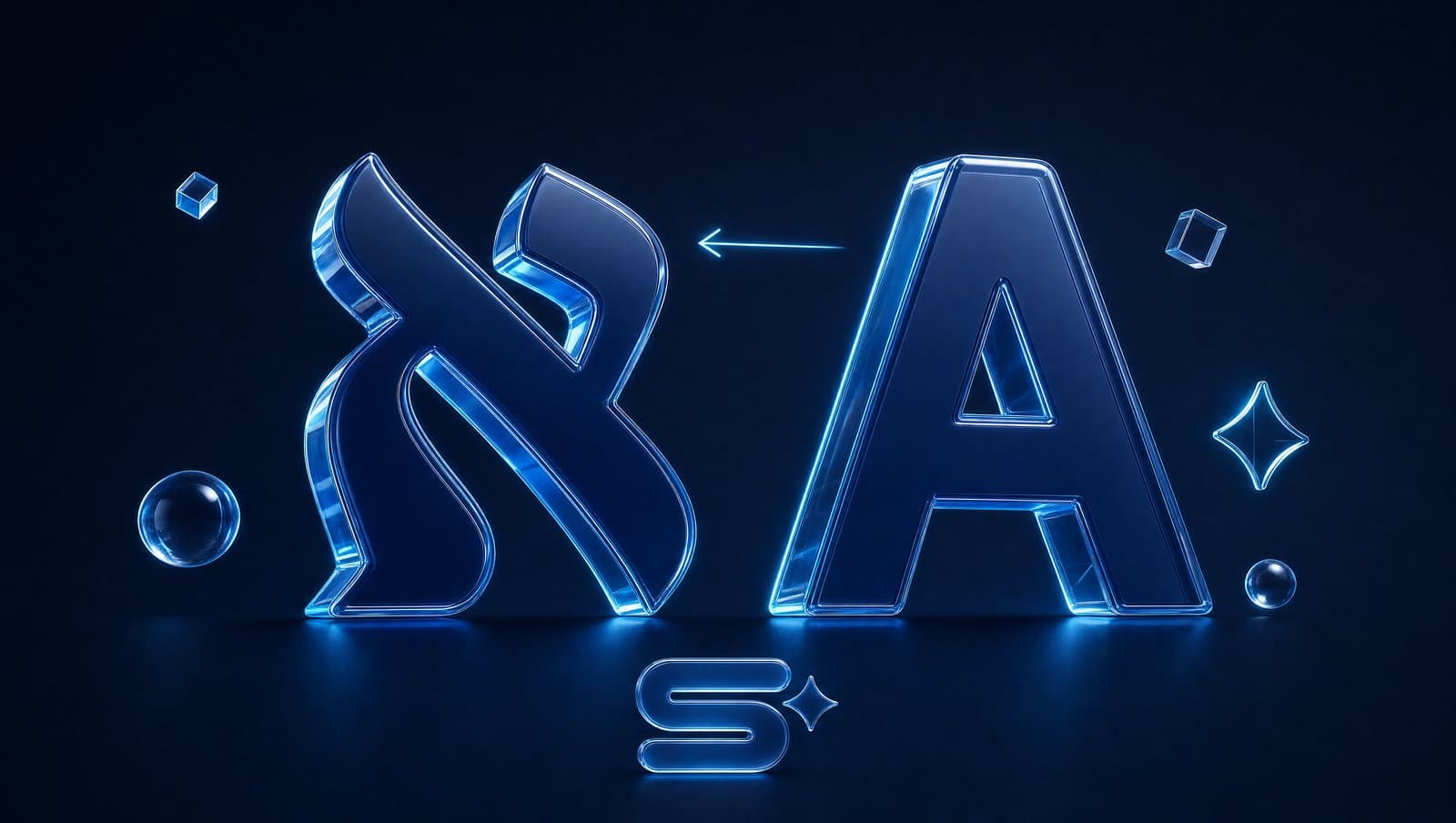
This is the critical element international design guides miss, yet it governs visual branding in Israel. Designing for Israeli businesses requires addressing three specific factors.
First, Reading Direction (RTL). In Hebrew websites, the logo sits in the top-right corner, and eyes scan from right to left. An icon positioned to the left of text feels natural in English but can disrupt visual flow in Hebrew. Solutions include symmetrical center marks or dual layout versions for RTL and LTR contexts.
Second, Hebrew Typography. Hebrew characters lack uppercase/lowercase distinctions and true italics, featuring unique horizontal proportions. Latin fonts “converted” to Hebrew often look awkward. Opt for fonts designed natively for Hebrew. Google Fonts offers dozens of free, commercially licensed Hebrew typefaces, while Israeli type foundries provide unique proprietary licenses.
Third, Bilingual Pairing. Most Israeli enterprises operate under Hebrew and English names. The rule: harmonize visual weight, cap height, and stroke thickness rather than forcing an identical typeface. Seamless pairings look like one cohesive typographic family. Ensure your logo font is also available as a web font so your website and digital business card match your logo perfectly.
How Simple Web Approaches Branding & Identity
Simple Web is an AI-powered digital agency based in Bnei Brak, certified Meta Partners, and Google Ads specialists serving 200+ businesses with 28 verified 5★ Google reviews. Our logo design is integrated into our comprehensive branding services: market research, custom mark creation, typography and palette engineering, visual systems, and living Brand Books delivered in 2–4 weeks. Pricing is customized based on scope following a free discovery consultation.
Our unified approach ensures your new logo seamlessly deploys across your custom business website, ad creatives, and digital collateral in unified visual harmony. We leverage AI tools to accelerate market research and conceptual exploration, while human design directors refine every vector curve with precision.
Summary
Exceptional logo design is the product of disciplined process: a clear brief, strategic research, distinct concept directions, meticulous refinement, and complete vector file delivery. Pricing in Israel scales with strategic depth and production scope. Before approving your final mark, run it through our 7 diagnostic tests, with particular focus on Hebrew RTL harmony. Schedule a free discovery audit with Simple Web to elevate your brand identity.
Tags:
Recent posts