Simple Web
Landing Pages
7 Tips for a Landing Page That Converts
Seven practical tips for building a landing page that turns visitors into customers, drawn from hands-on experience.
Simple Web TeamApril 5, 20254 min read

A landing page is the most critical stage of any marketing campaign. You can build the perfect Google Ads or Facebook campaign, and still watch all that money go to waste if the landing page does not convert. In this article we share 7 practical tips we have learned from building and optimizing hundreds of landing pages for businesses in Israel.
A headline that sells in seconds - the first impression
You have 3–5 seconds to convince a visitor to stay on the page. The main headline (H1) is the most important element of a landing page, because it has to answer the question "what do I get here?" immediately. A good headline is specific, talks about the benefit to the customer, and creates urgency.
Example of a weak headline: "Welcome to our company". Example of a strong one: "Get 50% more leads - without increasing your budget". The difference is clear: the strong headline talks about a tangible result the customer wants to achieve.
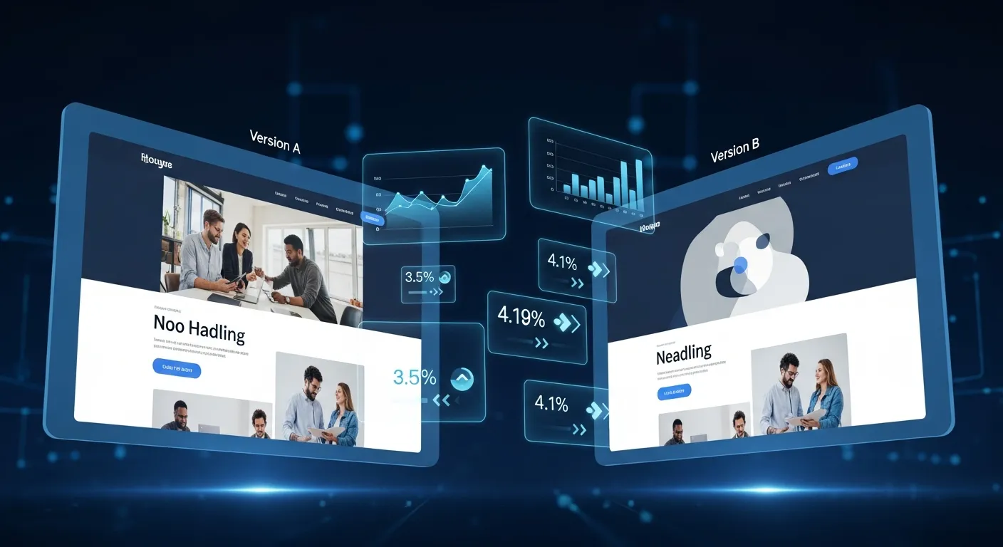
Pro tip: write 10–15 versions of the headline and pick the best. Then run an A/B test with 2–3 versions to see what actually works. Sometimes changing a single word in the headline can lift conversion by 20% or more.

Design that leads to action - CTA, hierarchy, and white space
Landing page design is about function long before it is about "looking pretty". Every element on the page should guide the visitor's eye toward the action you want them to take: filling out a form, making a call, or clicking a button.
Here are the core rules:
- CTA above the fold: the primary action button must be visible without scrolling. That does not mean there will not be additional CTAs further down - but the first one has to be up top.
- Clear visual hierarchy: size, color, and placement of elements should guide the visitor through a natural reading path from headline, through benefits, to social proof, to the action button.
- White space: do not fear breathing room. A cluttered page makes the visitor feel overwhelmed and leave. White space lets the eye rest and focuses attention on the important elements.
- Standout button color: the CTA button should be in a color that pops against the rest of the page. An orange button works well on a blue-toned page, and a red one stands out against green. Contrast is the key.
Social proof and trust - why should they believe you?
People do not like being first. They want to know others have already tried it and enjoyed it. Social proof is one of the most powerful tools for lifting landing-page conversions.
Types of social proof that work:
- Customer testimonials: real quotes with a full name and photo. The more specific the testimonial ("we grew sales by 35% in two months"), the more effective it is.
- Customer logos: if you have worked with recognizable brands, display their logos. It builds instant trust.
- Numbers: "500+ happy customers", "10 years of experience", "98% satisfaction". Concrete numbers are more convincing than general claims.
- Trust badges: certifications, accreditations, years in business, data security - anything that shows you are credible and professional.
Technical but critical - speed, mobile, and forms
Even the most beautiful and compelling page in the world will not help if it takes 5 seconds to load. Load speed is a critical conversion factor: studies show every extra second of load time cuts conversion by 7%. A landing page should load in 2–3 seconds, max.
Mobile optimization is no longer optional. With most traffic coming from phones, your landing page has to work perfectly on mobile: a form that is easy to complete with your thumb, comfortably sized buttons, and readable text without zoom.
With forms, less is more. In the first step, all you need is a name and phone number (or email). Every extra field you add lowers completion rate. If you need more information, collect it on the follow-up call, not in the form. At Simple Web we build landing pages that are mobile-friendly, load fast, and undergo continuous data-driven optimization.
Summary: A landing page that converts is a blend of psychology, design, and technology. A clear headline, a prominent CTA, social proof, fast loading, and mobile optimization may sound like just another list of "nice tips", but together they are the difference between a campaign that returns its investment and one that wastes money. Want us to build a landing page that actually converts? Happy to help.
FAQ
The average landing-page conversion rate is 2–5%, but it varies a lot by niche. Well-optimized landing pages can hit 10–15% or even higher. The key is not to benchmark against a general average but to measure and continuously improve your own page.
The fewer, the better. Usually name and phone number are enough in the first step. Every extra field cuts completion by roughly 10–15%. If you must collect more, consider splitting the form into steps (multi-step form), which works better than one long form.
A landing page is a single page with one clear goal (lead capture, sale, signup). There is no navigation menu and no distracting links, because everything is built to lead to one action. A regular website, by contrast, is a multi-page structure designed to provide comprehensive information about the business. Both are important, but each serves a different role.
A landing page needs continuous optimization. Run A/B tests regularly (at least once a month) on headlines, images, copy, and CTA buttons. But make big changes based on data, not gut feeling.


